
ABOUT THE PROJECT
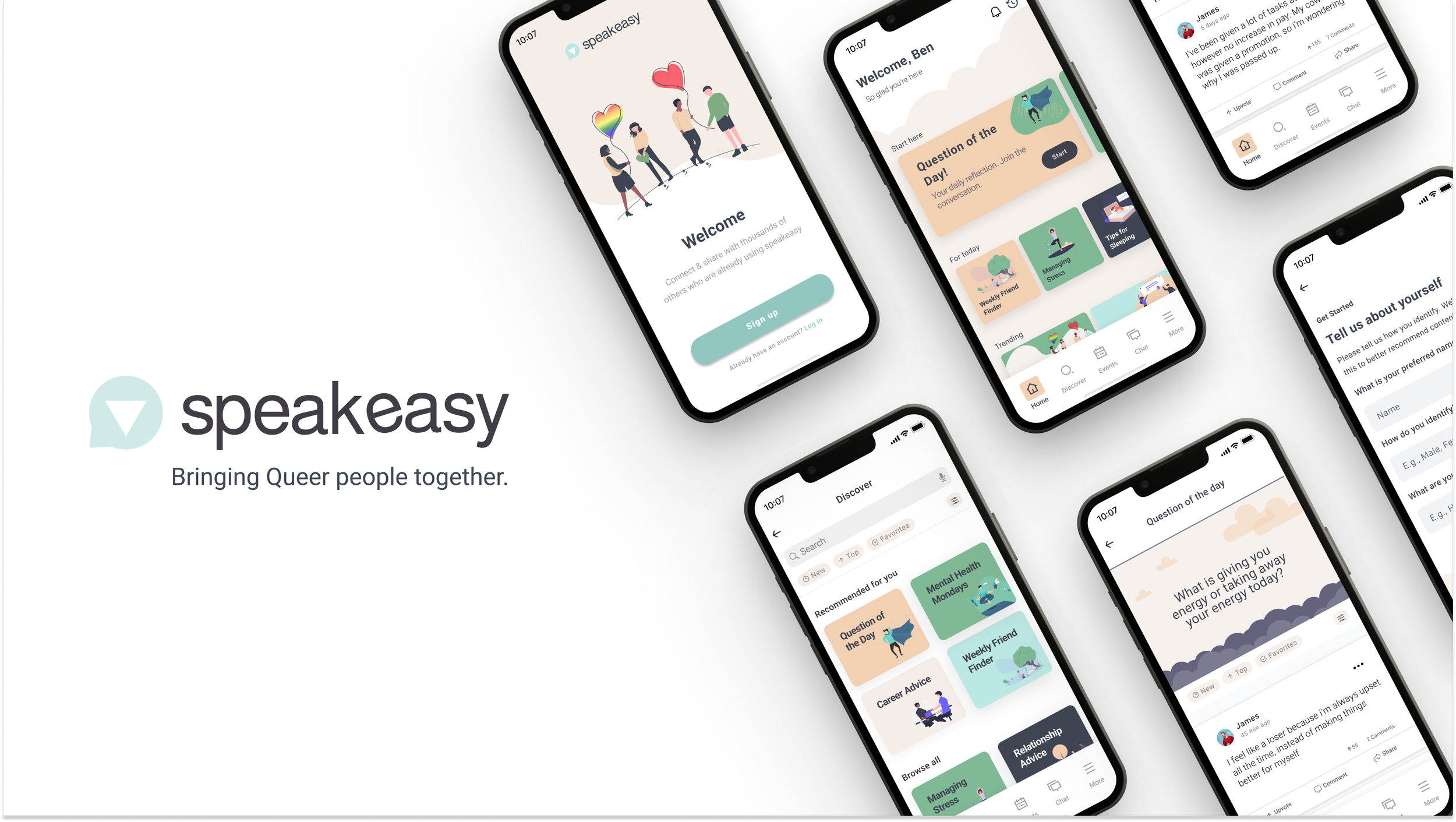
Speakeasy
Speakeasy is a queer social connection app that provides a safe space to share experiences, find support, and connect with others. It allows users to post, comment, and share threads, as well as join virtual workshops and events to get the mental health support that they need.
ROLE
UX/UI Designer
CLIENT
BrainStation - Capstone Project
DATE
6 Months
TOOLS
Figma, Figjam, Photoshop, Pencil & Paper
EMPATHIZE
Research
To better understand and empathize with my users I first needed to understand the impacts of depression on queer people today.
I began conducting research with the following goals in mind.
Research Goals:
Discover an accurate definition of depression & the impacts it has on queer people today
Understand the experiences queer people have with LGBTQ+ applications and mental health services
Conduct interviews to validate who my real users are and determine their goals, needs, behaviours, motivations, and pain points
Utilize both primary and secondary research to define a problem space, how might we, and hypothesis statement
From my secondary research & interviews build a user persona
Defining depression in queer men
The prevalence of depression among gay men is three times higher than the general adult population. Depression being defined clinically as the experience of a depressive mood or loss of interest or pleasure in nearly all activities over a 2-week period. In terms of cause–effect and triggers for depression, a range of factors have been detailed, many of which are intertwined with the stress that can accompany being part of socially marginalized communities.
Stress factors of socially
marginalized communities
-
Prejudice Events
Like research with African Americans and other ethnic minority groups, researchers have described antigay violence and discrimination as core stressors affecting gay and lesbian populations
-
Stigma
Expectations of Rejection & Discrimination. The anxiety with which the stigmatized individual approaches interactions in society. Such an individual “may perceive, usually quite correctly, that whatever others profess, they do not really ‘accept’ him and are not ready to make contact with him on ‘equal grounds’
-
Concealment of Identity
Studies have shown that suppression, such as hiding secrets, is related to adverse health outcomes and that expressing and disclosing traumatic events or characteristics of the self improve health by reducing anxiety and promoting assimilation
-
Internalized Homophobia
Internalized homophobia represents a form of stress that is internal and insidious. In the absence of overt negative events, and even if one’s minority status is successfully concealed, lesbians and gay men may be harmed by directing negative social values towards themself.
Help Seeking
Regardless of sexual orientation, men can be reluctant to seek help for mental health problems. An American study reported that less than one quarter (23%) of gay men who attempted suicide sought mental health or medical treatment.
For gay men, there are limited specialist health services, and this can also be a barrier to help seeking. Reticence for help seeking can stem from gay men’s exposure and subsequent resignation regarding the
inadequacies of health care services and the failure to meet their specific needs. Unfortunately, gay men who do seek help may experience discrimination in the health care system. A study of 130 U.K.-based respondents revealed that many gay men felt invisible and ignored when services specific to their needs were not available, or when personnel were insensitive to their needs.
”One of the biggest things with everyone who is coming out is we feel “alone” especially coming from smaller communities. I think having a positive introduction goes a long way of putting their mind at ease, where people are less of an outsider and more in a place where they belong and that there are other people like them.”
— Scott
Conducting Interviews
To validate my research and empathize with my users more deeply, I conducted user interviews with 4 participants.
Participant Criteria:
25-60
Lives in Ontario Canada
Someone who identifies as queer / LBGTQ+
Someone who has identified that they struggle with mental health issues
Someone who is willing to seek mental health advice or provide mental health advice to others
Participant Criteria Learning:
I learned the true value of having good participant criteria from this project. When conducting interviews on a sensitive subject like mental health, some of my participants would deny that they struggle with mental health, and another said they were not comfortable helping others, taking themselves out of my criteria. I learned it’s best to pre-screen participants by asking minor questions that ensure they align with your participant criteria before accepting to interview them.
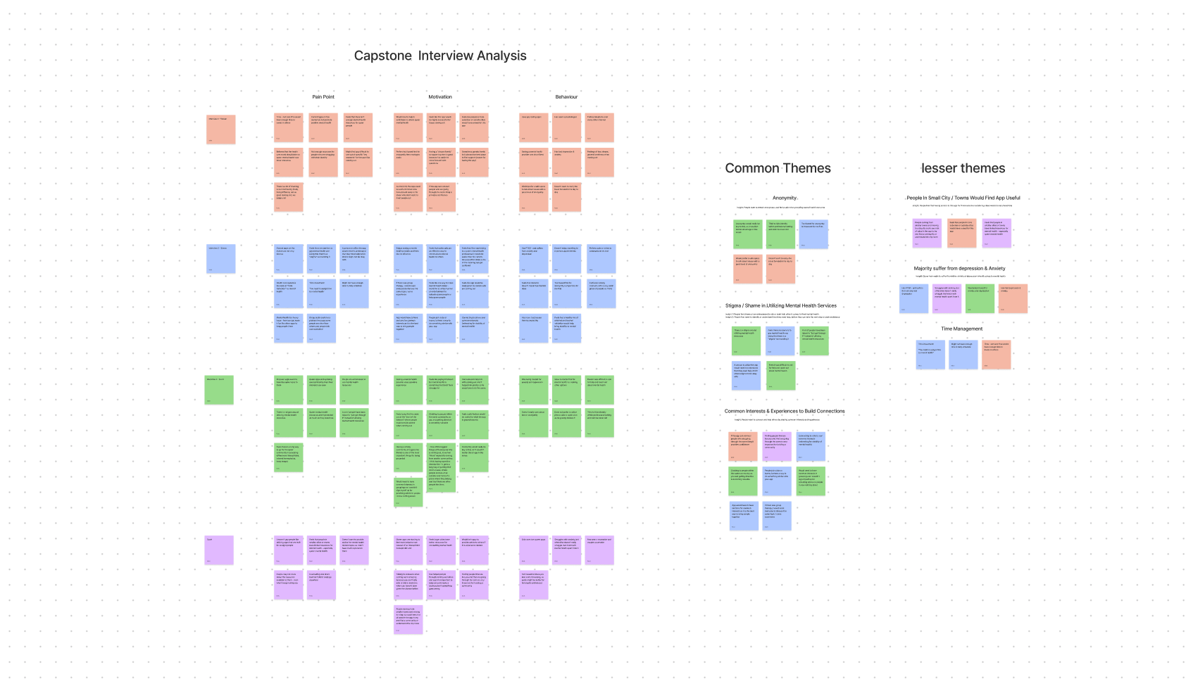
Interview Insights
-
Anonymity
People want to remain anonymous and feel safe when providing mental health concerns and experiences
-
Stigma / Shame
People feel shame or are embarrassed to ask or seek help when it comes to their mental health
People first need to identify or understand that they need help, before they can take the next step in seeking assistance
-
Common Interests
People want to connect and help others by sharing common interests and experiences
-
Small Cities / Towns
Participants find that queer men outside large cities might find the app more useful, as it could give them a place to be more open and discover who they are
-
Depression & Anxiety
All participants suffer from anxiety or depression which aligns with secondary research
*It’s also interesting and worth noting that participants would try to tell me that they are different or an outlier from from the research I have found. When they are not
-
Time Management
Participants do not want to use a mental health app if it is going to cost them a lot of time. Which presents a very difficult design challenge
Design Challenges
At this stage I noticed there were a lot of design challenges & constraints that I would need to address when building. Based on my interview insights I would have to build an app that allows users to remain anonymous, create a place for people to discuss & connect through common interests, and make sure that my app is quick and easy to use (time management).
User Persona
Using what I learned from both my secondary and primary research, I created a user persona that represents who I am designing for. This persona helped guide my decisions along the design process where I specifically incorporated the design challenges above - anonymity, common interests, and time management.

DEFINE
Problem Space
The prevalence of depression among gay men is three times higher than the general adult population with most resources being spent elsewhere like harm reduction and HIV other than mental health.
However, research has shown that family support has been identified as a protective factor in lowering the risk for depression and suicide & that many adult gay men rely on friends for social support, it may be helpful to explore a man’s level & type of participation in gay communities as identifying with the gay community can correlate with improved mental health.
Therefore, building an application that helps queer people come together and participate in a community that promotes help seeking and advice, can lead to reduced depression and an improvement in mental health.
How Might We
Build a safe space for queer people who have mental health issues or experienced trauma, share their experiences and offer support, to promote a greater sense of community & well-being.
Hypothesis
I believe by creating an app that allows queer people to come together and share common interests & experiences it will lead to improved mental health, sense of community, and well-being.
I will know this is true when I see people find value in others posts, comments, shared experiences, and advice within threads and topics.
IDEATE
Concept Development
To begin my design ideation and concept development I broke down each step into individual goals, they are:
Design Goals:
Epics & User Stories
Task Flow
Inspiration Board
Sketches
Mid-fi Screens & Prototype
Epics & User Stories
I started my initial ideation by writing 30 user stories, keeping my persona, HMW, and design challenges in mind.
I then categorized each user story into epics to help me understand the actions a user would take within my app. After analyzing the user stories and epics, I chose my primary epic as “Posting.”
Refined User stories:
For my refined user stories, I wanted to focus on making the experience like a forum or a social hub / community for all queer people. As I continued to refine my user stories it was clear that the bulk of the actions my user would take would be through posting. Through my refined user stories I started to notice the parallels between well known apps like Facebook, Reddit, and some Q&A websites like Quora.


It’s important to note that at this stage, I was considering making an app strictly for gay men. After writing my user stories, I found that I could shift my perspective and create an app that would serve the full LGBTQ+ community.
Task flow
By determining a primary epic “Posting” and through writing refined user stories, I was able to move onto creating an initial task flow for my user.
For my task flow I wanted to focus on a new user, who would be taken through the full onboarding journey.

Inspiration Board
For inspiration, I initially focused on two apps, they were:
Pridecounselling
Shine App
I believed that I could merge these two apps together to create an app that would focus on counselling & community. HOWEVER, I learned this isn’t the case and that simplification is the best means to building an app.
Moving in a different direction:
After this turning point I changed my point of view and drew new inspiration on apps with great onboarding journeys and apps that had great community building. They were:
Reddit
Facebook
Discord
Headspace
Bloom
Calm

Exploratory Sketches
For exploratory sketches, I mainly played around with different ways competitors utilize cards and drawers. Within my mid-fi screens I rely heavily on drawers to tuck away information and pull up information that is helpful to the user. You will also see me drawing on Facebook and Reddit as inspiration for how my app will move/interact.


Mid-fi Screens

For my initial mid-fi screens and overall flow, I focused on “Hick’s" law. I wanted the distance from sign up to responding to a post to be short in distance, so I don’t lose my user. This ladders back to my “time management” design challenge. I really wanted to focus on making this app recognizable and as easy to use as possible.
PROTOTYPE & TEST
User Test Plan
To test how usable the above mid-fi screens and prototype was, I tested with 5 different participants. Each user was able to complete each task, however there were some noticeable design issues that stood out.
Major Design Issues:
“Discover” navigation hit box was difficult to tap / broken
Text size overall was small, especially on post pages
Copy on “Get Started” screen needed to be moved down
Some design elements on the home screen were out of place when user scrolled over
On slide drawer, “Copy text” button should be removed as it’s redundant
Below I will show the overall testing results and how I resolved each major design issue.
Overall Testing Results
All users were able to action every task given to them based on initial prototype. The overall sentiment was high, with praise for the content and the app being very “familiar” with other social apps they currently use.

Major design issue 1
“Discover” navigation hit box was difficult to tap / broken
Solution:
I grouped the navigation icon and text together to allow for a larger hit box that is more easy for the user to tap. I then grouped all remaining icons and text together so the experience is consistent when tapping through nav options.

Major design issue 2
Text size overall was small, especially on post pages
Solution:
Only one participant called this out, however I questioned this myself when designing. My device type when building is an iPhone 13 mini, which might cause the issue, but just in case I increased the font size from 14px to 15px.

Major design issue 3
Copy on “Get Started” screen needed to be moved down
Solution:
I moved the content down & updated the spacing between elements to address the issue of copy being too high up on the screen. A quick note that the final hi-fi design changes, and this screen goes through another iteration where I move the copy and text fields lower.

Major design issue 4
Some design elements on the home screen were inconsistent and out of place when user scrolled over
Solution:
Updated the design elements for consistency, and removed the object that didn’t belong within this scrolling section.

Major design issue 5
On slide drawer, “Copy text” button should be removed as it’s redundant
Solution:
As phones have a gesture when holding down on the screen to copy text, this button is no longer needed within the slide drawer, so I removed it.

Initial & Revised Mid-FI Prototypes
Initial Mid-Fi Prototype
Revised Mid-Fi Prototype
Hi-fi Prototype
Visual Design & Branding
For the hi-fi visual design of my application, I used this chance as another round of iteration when it came to the design of my app. I tweaked many screens, especially within my onboarding screens, and also ended up changing the original card designs to something more modern utilizing “flat design.” I will break this all down as I go through the below visual design goals.
Visual Design Goals:
Mood Board
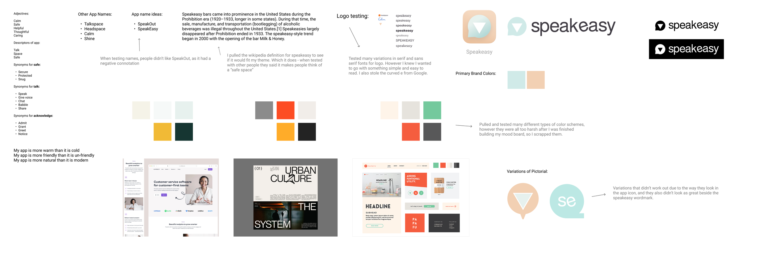
Brand Colors
Word Mark & App Icon
User Interface Library
Final Hi-Fi App Design
Mood Board
The inspiration for the Speakeasy brand and mood board can be defined by the words:
Natural
Warm
Welcoming
I wanted to make sure that the brand is cozy and a space that is friendly & warm so people will share their feelings and be open and honest with one another.

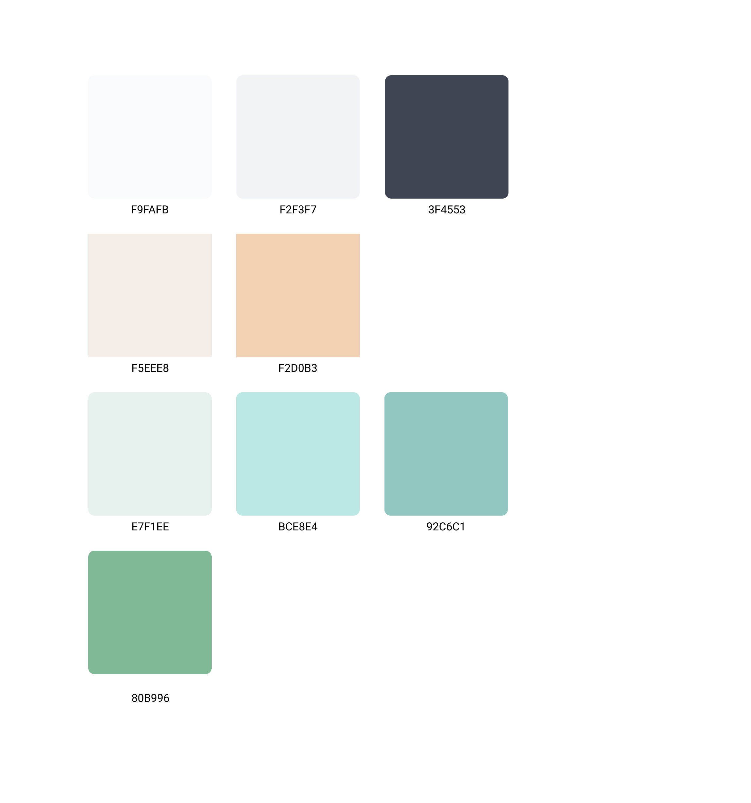
Brand Colors
My brand colors were selected from the mood board above, and then balanced into a warm pastel palette.
Word Mark & App Icon
I built the word mark, after defining the mood board and brand colors. The word mark came from testing variations of san serif and serif fonts, until I landed on something that felt casual. I then slanted the one e based off Google.
The chat icon within the pictorial defines the chat & social/communication aspect of the app & the upside down triangle stands for gay pride. I kept this subtle as I wanted it to be a silent nod to the history of LGBTQ+ people.

Flat Design & Cards
When updating my design, I made a shift when I started heavily reviewing the Headspace app and what makes it successful.
Through flat design and illustration, I wanted to try and replicate some of the fun and friendly energy that the Headspace app has, as it really gives their application a sense of character and a unique identity that helps differentiate them from others in the mental health space.

User Interface Library
I categorized my library with both branding & interface elements. If I was to go back and add in more things to my interface library it would be my dimensions of cards and state changes, error and positive feedback states.

Branding Iterations
Not everything came easy however. I went through many iterations of wordmarks, pictorials, and brand color schemes. Below is the process document that I used throughout my journey when finalizing all of my brand elements.
I’ve annotated sections accordingly to show my thought process on why I made decisions the way that I did.
Hi-Fi App Design
For the final hi-fi app you will see that lots has changed. I’ve completely overhauled the majority of the onboarding flow, at least up to screen 4, from then on I used a mixture of illustrations and flat design to finalize the look and feel of my app.

Responsive Design
Marketing Website
An additional requirement for our capstone project was to translate our app into both a desktop and mobile version of a marketing website. Below are the responsive design goals I had.
Responsive Design Goals:
Stay consistent and on brand throughout both desktop and mobile experiences
Try to keep all modules as “mobile first” as possible
Utilize an animated gif to showcase and highlight a feature
End the website with convincing testimonials
Responsive Design Prototypes

Desktop Web Prototype

Mobile Web Prototype
NEXT STEPS
Looking to the future
As I am currently learning Front End Development and iOS Development. I’d like to explore making this application a full release on the App Store.
Next Steps:
Conduct further user testing and surveys to understand if the LGBTQ+ community has an appetite for this type of application
Work through refinements, and develop all other additional channels required to developing the App
Dev the application in “Swift”
What did I learn?
Listen carefully and select accurate participants
I learned how to ask difficult questions, but what I found more valuable was listening to the answers. I didn’t stop my participants if they needed to get something off their chest and I also didn’t press a question if my participants felt uncomfortable. I did however learn that some participants can take themselves out of your criteria based on their answers. Which was a very valuable learning experience.
Study competitors
I downloaded over 40 applications to understand how they tackled design problems similar to mine, then put those learnings into my application, particularly when it came to prototyping & drawer interactions.
Don’t be afraid to test & learn
This is a very challenging concept and idea to bring forth into an application, not only because it’s built for LGBTQ+ people, but also because there are no other Apps similar. I really had to test multiple concepts before landing on one that felt right or worked for what I was trying to build.