

ABOUT THE PROJECT
Steam Heuristic Evaluation
Performed a heuristic evaluation on the purchase flow of Steam.com. Through this exercise our team discovered ways in which we could address the heuristic violations and re-design the flow to better help the customer convert.
ROLE
UX/UI Designer
CLIENT
BrainStation Case Study (Education)
DATE
2 Weeks
TOOLS
Figma, Figjam, Pencil & Paper
Heuristic Evaluation Review
In our initial heuristic evaluation we discovered 6 Heuristics. 3 being persistent & major problems for our user within our purchase journey.
They were:
Consistency & Standards:
Users face pricing and image inconsistencies throughout product, bundle info, & shopping cart pages
Aesthetic & Minimalist Design:
There is visual clutter, repetitive categories & irrelevant information throughout each page of the purchase journey
Recognition Rather than Recall:
The Steam website asks the user to memorize far too much information, which can cause the user to bounce from site instead of converting on their purchase
Methodology

Competitive Research
When redesigning our screens we drew inspiration from Nintendo, Sony, and Epic Games. This was to ensure consistency, familiarity of shopping experience & recognition for our user.

Updated Design Guidelines
In our design guideline we decreased the margin and increased the FOV or field of view for our users by moving to a modern column grid layout, which allows the content to breathe and be larger, more easily read, and accessible to the user. Our guideline also allows us to create a visually cohesive and consistent experience for our user whereas some pages in the existing flow are not consistent.

Re-Design - Scope of Evaluation
For our workflow we narrowed down our scope of work and screens by highest impact and lowest effort.
The screens we optimized were:
Product Page
Bundle Information - This page was removed after redesign, as we simplified the customer journey and added DLC Bundles to the product page
Shopping Cart
Sign In
Email Verification
Redesigned Screens
Product Page - Before
Heuristics:
Consistency & Standards, Aesthetic & Minimalist Design
“Add to cart” button doesn’t appear within the overview of the product which is standard based on our competitive research (Epic Games, Nintendo & Sony).
Recommendation:
Place “Add to cart” CTA underneath the product overview and streamline the visual aesthetic

Product Page - After
Consistency & Standards:
Moved “Add to Cart” button to the right of trailer
Added “Buy Now” & “Add to Wishlist” CTA based on competitive research
Updated trailer size to fit within column spacing
Expanded margins from a “block grid” to a “column grid”
Moved game title to the right and added H1 textile
Applied 8-pt grid to all elements to have a consistent visual hierarchy
Aesthetic & Minimalist Design:
Removed all non-essential copy & buttons to reduce visual clutter

Product Page (DLC Bundle Info) - Before
When a user scrolls down on the product page they find the Downloadable Content (DLC) for purchase.
Heuristics:
Aesthetic & Minimalist Design
The visual clutter is competing for too much attention from the user. Buying options should be simplified and a visual hierarchy established to allow the user to take the desired action (adding to cart) more quickly.
Recommendation:
Simplify buying options
Steamline and move pricing and % OFF location

Product Page (DLC Bundle Info) - After
When a user scrolls down on the product page they find the Downloadable Content (DLC) for purchase.
Aesthetic & Minimalist Design
Utilized competitive research to rebuild the DLC Bundles into cards which simplifies the information & reduces visual clutter
Removed percentage savings pricing and added price callouts to each card
Removed all non-essential copy & buttons to reduce visual clutter
Expanded margins from block grid to column grid
Applied 8pt grid to all elements for better visual hierarchy

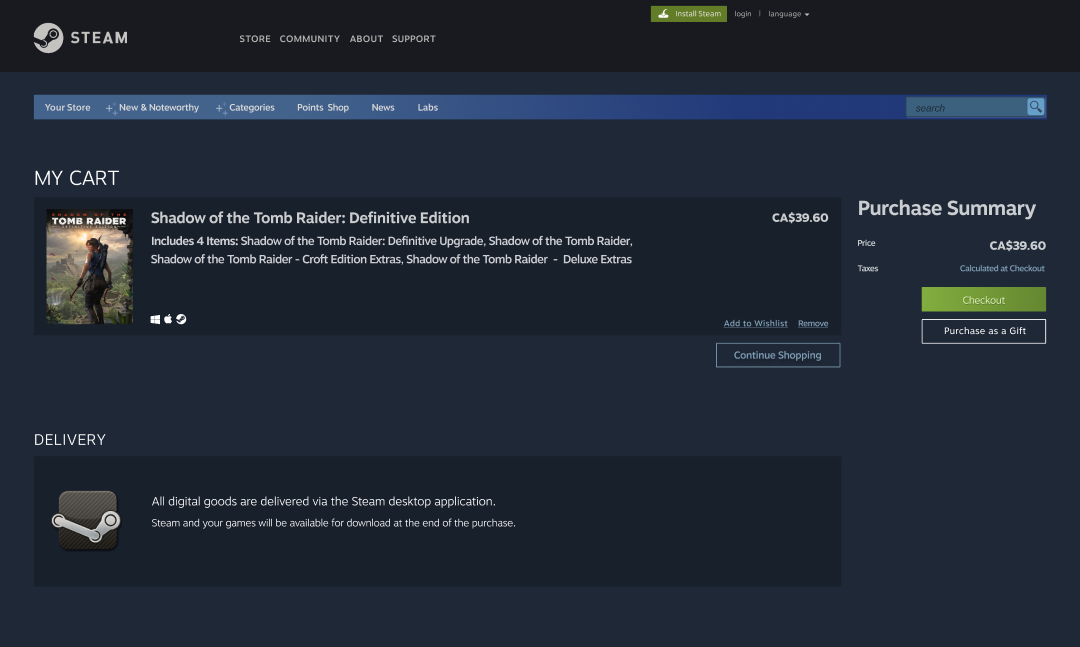
Shopping Cart Page - Before
Heuristics:
Consistency & Standards
Game price & image is inconsistent across purchase journey causing user to double check or second guess their purchase.
Error Prevention
“Purchase as a gift” CTA is visible but disabled which can cause the user to be distracted during goal of purchase.
If goal was to purchase this game as a gift, the user would not be able to complete transaction.
Recommendation:
Make game price & game image consistent through purchase journey
Enable “Purchase as a gift” CTA

Shopping Cart Page - After
Consistency & Standards:
“Purchase for myself” CTA was updated to “Checkout” as a primary CTA to address consistency & customer expectation / familiarity
Utilizing competitive research, purchase summary was added to the right of item details
Removed all non-essential copy to reduce visual clutter
Expanded margins from block grid to column grid
Applied 8pt grid to all elements for better visual hierarchy
Error Prevention:
Enabled “Purchase as a Gift” CTA as a secondary CTA
Moved “Continue Shopping” CTA as a tertiary CTA to allow user to “go back” & continue to browse
Sign In / Sign Up Page - Before
Heuristics:
Consistency & Standards
User is directed to the “Create an Account” page to finalize purchase. “Sign in” form & “Join Steam” button are separate which does not match competitors sites or user expectation.
Recommendation:
Move sign in to the center of the page
Add “Create account” or “Sign up” CTA

Sign In / Sign Up Page - After
Consistency & Standards
“Join” Steam” image, copy, and button were removed with a “Create Account” secondary CTA added below “Sign In” CTA to address Consistency & Standards heuristic
“Sign In” form was moved to the centre of the page to draw users attention & be in line with competitors websites
Form field colour was updated to address accessibility concerns with contrast
“Sign In” copy was updated to H1 textile
Applied 8pt grid to all elements for better visual hierarchy

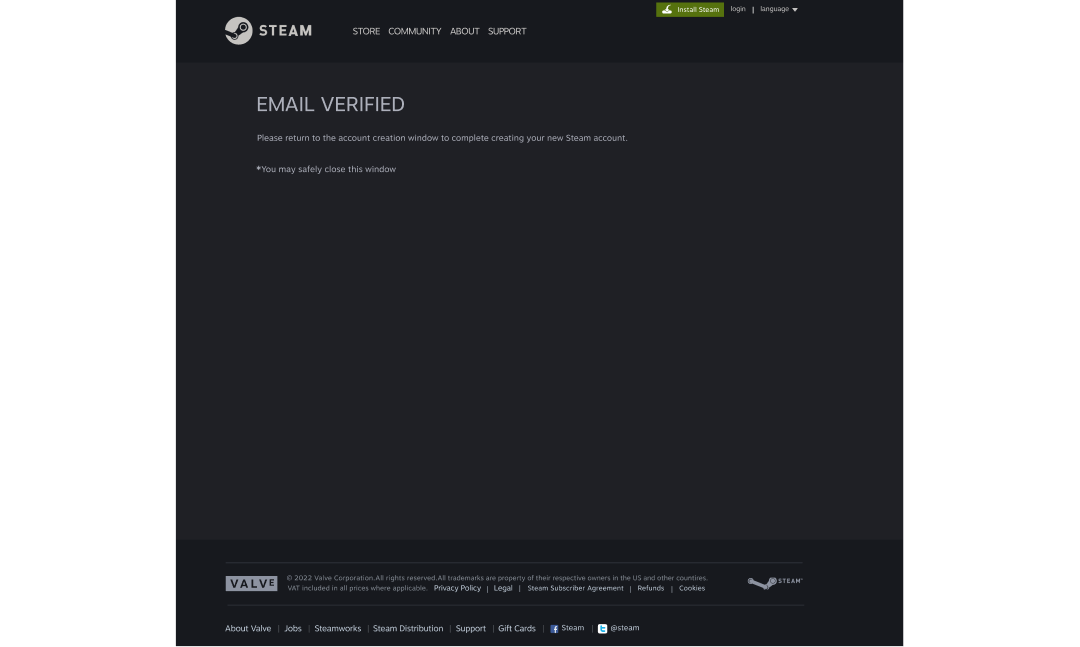
Email Verification Page - Before
Heuristics:
Visibility of System Status
After user verifies email, users are requested to “safely close window” leaving the user stranded to find the sign in page again.
Recommendation:
Automatically login user OR add CTA that directs them to the sign in page
Email Verification Page - After
Visibility of System Status:
“Log in Now” CTA was added to redirect user to sign in page addressing Visibility of System Status heuristic
A green check mark icon was added for visual feedback of email verification success
Copy was moved to centre of page to grab the users attention and become the main action for the user
“Email Address Verified” copy was updated utilizing H1 textile

What did I learn?
Use consistency to your advantage
This exercise truly taught me that when designing it is best to use patterns or familiar / consistent designs across your product. I’ve taken this back into my practice at my current role when designing email modules which are based on site designs. This allows email to feel like an extension of the site, and allows the customer to act more quickly.
When in doubt cut it out
I learned to cut back on unneeded copy, or unneeded cluttered design. I was very surprised to see how many elements and pieces of copy that was and is unneeded on Steams website.
Offer advice to peers
During this project my team worked very close on what we thought was best, particularly when viewing competitor websites and what we felt was natural. I believe our candid feedback greatly helped us succeed in building excellent designs.